The Importance of Mobile-First Design
Not long ago, mobile optimization was considered a secondary step in digital design. Teams built desktop websites first and then adjusted layouts to “fit” smaller screens.
That era is over.
Today, mobile-first design is not a trend. It is the foundation of effective digital strategy.
Consumers browse, shop, research, compare, communicate, and transact primarily through mobile devices. Search engines prioritize mobile performance. Social platforms are mobile-native. Even email engagement is dominated by smartphones.
Designing for desktop first and shrinking down no longer works.
Mobile-first design means starting with the smallest screen and building upward — prioritizing speed, clarity, usability, and performance from the beginning.
This article explores why mobile-first design matters, how it affects marketing and business outcomes, and how to implement it strategically.
What Is Mobile-First Design?
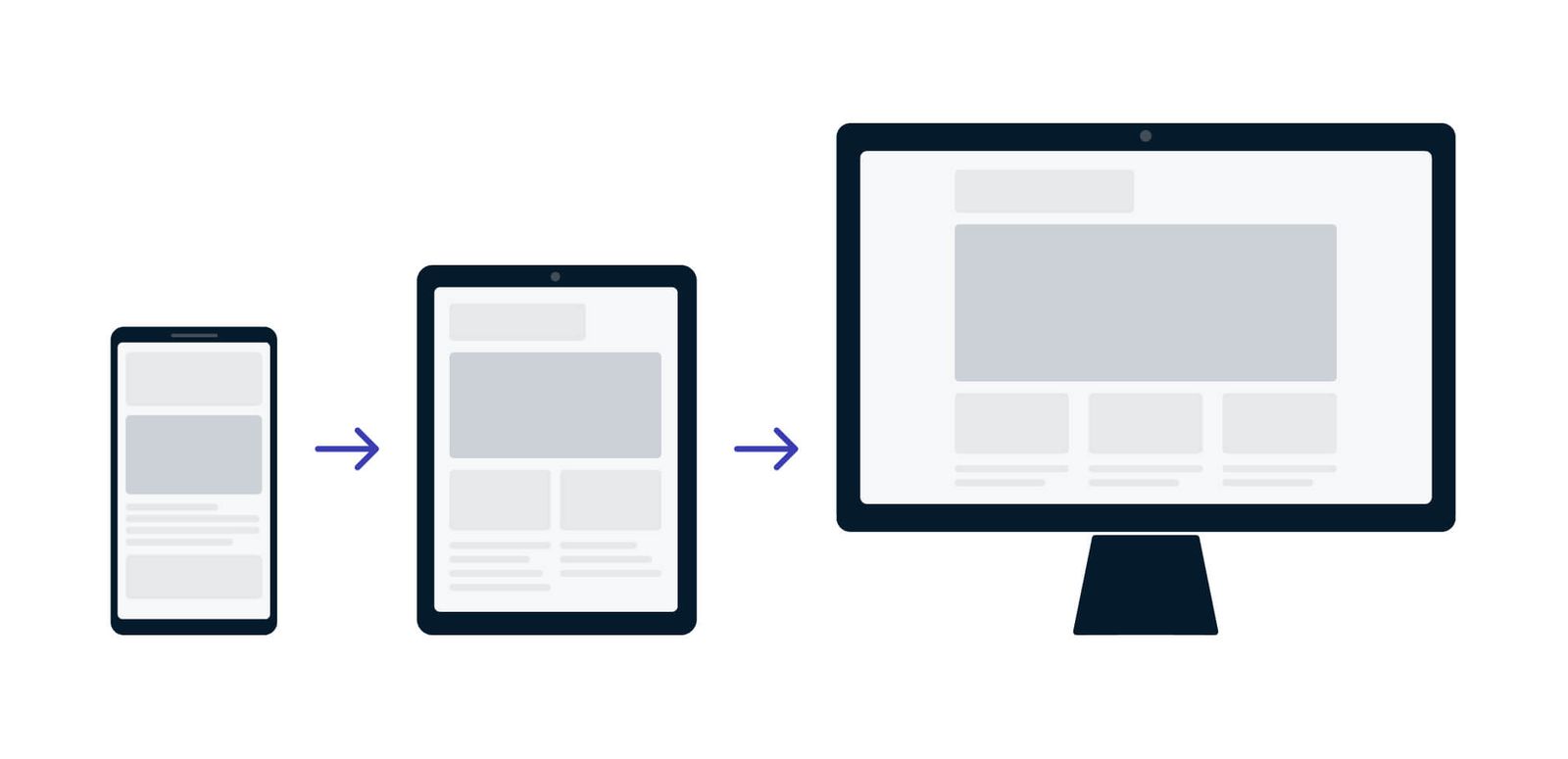
Mobile-first design is a product and website design approach that begins with mobile device constraints and progressively enhances for larger screens.
Instead of:
Desktop → Tablet → Mobile
The flow becomes:
Mobile → Tablet → Desktop
This shift changes priorities.
On mobile, you must:
-
Eliminate unnecessary elements.
-
Prioritize essential content.
-
Simplify navigation.
-
Optimize performance.
-
Reduce friction.
When you design under constraints, clarity improves.
Why Mobile Dominates Digital Behavior
Mobile devices are now the primary gateway to the internet for most users worldwide.
People use smartphones to:
-
Browse products while commuting.
-
Compare prices in-store.
-
Read emails throughout the day.
-
Scroll social media.
-
Watch short-form video.
-
Research services.
-
Complete purchases.
The average user does not sit down at a desktop computer to explore casually anymore. Mobile usage is constant, contextual, and behavior-driven.
Design that does not accommodate this reality sacrifices engagement and revenue.
Mobile Behavior Is Different from Desktop Behavior
Understanding mobile-first design requires understanding mobile behavior.
Mobile users:
-
Scan more than read.
-
Expect instant loading.
-
Use one hand frequently.
-
Interact through touch, not mouse.
-
Experience distractions and interruptions.
-
Have shorter attention windows.
This influences layout, typography, interaction design, and content strategy.
Desktop design tolerates density.
Mobile design demands focus.
Search Engines Prioritize Mobile Experience
Search engines now evaluate websites primarily through mobile versions.
If your mobile site is:
-
Slow
-
Difficult to navigate
-
Hard to read
-
Unresponsive
Your visibility suffers.
Mobile performance affects:
-
Search rankings
-
Bounce rates
-
Dwell time
-
Conversion rates
A mobile-first mindset is not just about user experience. It directly impacts discoverability.
The Business Case for Mobile-First Design
Mobile-first design influences measurable outcomes:
-
Higher engagement rates
-
Lower bounce rates
-
Increased conversion rates
-
Improved retention
-
Better brand perception
If most traffic originates from mobile but the experience is frustrating, acquisition efforts are undermined.
Marketing can drive visitors.
Design determines whether they stay.
Speed Is Non-Negotiable
Mobile networks vary in speed and stability. Even minor delays feel amplified.
Users expect pages to load within seconds. Every additional second of delay increases abandonment risk.
Mobile-first design prioritizes:
-
Optimized images
-
Compressed code
-
Minimal scripts
-
Efficient loading sequences
-
Lightweight frameworks
Performance is part of design.
A visually impressive site that loads slowly is ineffective.
Simplicity Enhances Clarity
Mobile-first design forces prioritization.
With limited screen space, you must decide:
-
What is essential?
-
What supports conversion?
-
What distracts?
-
What can be removed?
This often results in:
-
Cleaner layouts
-
Stronger headlines
-
Clearer calls to action
-
Reduced clutter
-
More intentional hierarchy
Constraints improve discipline.
When design scales up to desktop from a simplified mobile structure, clarity remains intact.
Navigation Must Be Intuitive
On desktop, complex menus can work.
On mobile, navigation must be:
-
Clear
-
Thumb-accessible
-
Minimal
-
Logical
Common mobile navigation principles include:
-
Sticky navigation bars
-
Clear iconography
-
Simplified menu structures
-
Prominent search functionality
-
Reduced dropdown complexity
If users struggle to find information, they exit quickly.
Navigation friction is conversion friction.
Touch Design Changes Everything
Desktop interactions rely on precise cursor control.
Mobile relies on touch.
This changes:
-
Button size requirements
-
Spacing between elements
-
Scroll behavior
-
Form field design
-
Interactive components
Small clickable areas increase frustration.
Mobile-first design ensures:
-
Large tap targets
-
Clear feedback on interaction
-
Avoidance of hover-dependent functionality
-
Logical vertical scrolling
Design must match the physical realities of device use.
Content Strategy in a Mobile-First World
Content must adapt to mobile consumption patterns.
Mobile-first content typically includes:
-
Shorter paragraphs
-
Clear subheadings
-
Bullet points
-
Strong visual hierarchy
-
Concise messaging
-
Immediate value delivery
Long dense blocks of text discourage engagement.
Mobile readers skim.
Design should support scanning and quick comprehension.
Forms and Conversions on Mobile
Forms are often the biggest friction point in mobile conversion.
Mobile-first form design emphasizes:
-
Minimal required fields
-
Autofill compatibility
-
Clear error messaging
-
Numeric keypad for number fields
-
Simplified checkout processes
-
One-click payment integration
If a checkout process requires excessive typing, abandonment increases.
Conversion optimization must reflect mobile realities.
Ecommerce and Mobile-First Expectations
Mobile commerce continues to grow.
Shoppers expect:
-
Smooth browsing
-
Easy filtering
-
High-quality zoomable images
-
Fast checkout
-
Secure payment options
-
Transparent pricing
Mobile-first ecommerce design often prioritizes:
-
Vertical product exploration
-
Swipeable galleries
-
Simplified cart summaries
-
Persistent checkout buttons
A frustrating mobile shopping experience drives users to competitors instantly.
Mobile-First Email Design
Email marketing is heavily mobile-driven.
Mobile-first email design requires:
-
Single-column layouts
-
Large fonts
-
Clear CTA buttons
-
Minimal image dependency
-
Concise copy
-
Responsive formatting
If email content requires zooming or horizontal scrolling, engagement drops.
Mobile-first design applies across all channels.
Social Media Is Mobile-Native
Most social media engagement happens on mobile devices.
Brands must design:
-
Vertical visuals
-
Short-form video
-
Caption-friendly text
-
Thumb-stopping headlines
Desktop-designed assets often underperform on mobile-first platforms.
Mobile design influences brand perception on social channels.
Accessibility and Mobile-First Design
Mobile-first thinking also supports accessibility.
Key considerations include:
-
Readable font sizes
-
Adequate contrast
-
Clear visual hierarchy
-
Voice search compatibility
-
Screen reader compatibility
-
Logical content structure
Accessibility improves overall usability.
Designing for mobile often enhances inclusivity.
Progressive Enhancement: Building Upward
Mobile-first does not ignore desktop.
It builds upward intentionally.
Core structure is defined at mobile scale.
Then enhancements are added for larger screens:
-
Multi-column layouts
-
Expanded navigation
-
Additional visual elements
-
Richer imagery
This ensures that desktop benefits from clarity rather than clutter.
Data-Driven Mobile Optimization
Mobile-first design should be informed by data.
Track metrics such as:
-
Mobile bounce rate
-
Mobile conversion rate
-
Scroll depth
-
Time on page
-
Device-specific abandonment
-
Page load time
Analyze differences between desktop and mobile behavior.
If mobile conversion significantly lags, design adjustments are necessary.
Common Mistakes in Mobile-First Implementation
Avoid these pitfalls:
1. Shrinking Desktop Design
Simply resizing elements is not mobile-first design.
2. Ignoring Performance
Heavy scripts and oversized images undermine mobile speed.
3. Overloading Content
Too much information overwhelms small screens.
4. Overlooking Testing
Test across devices, operating systems, and screen sizes.
5. Treating Mobile as Secondary
Mobile-first must influence strategy from the beginning.
Mobile-First and Brand Perception
A seamless mobile experience signals:
-
Professionalism
-
Modernity
-
Reliability
-
Customer-centric thinking
A poor mobile experience signals:
-
Outdated infrastructure
-
Neglect
-
Friction
-
Inattention to user needs
Brand perception forms quickly on mobile.
Users rarely give second chances.
The Psychological Impact of Friction
Mobile users are often in motion — physically and mentally.
They are:
-
Waiting in line
-
Commuting
-
Multitasking
-
Switching apps rapidly
Design friction feels amplified in these contexts.
Mobile-first design reduces cognitive load.
When interactions feel effortless, engagement increases.
Competitive Advantage Through Mobile Excellence
In crowded markets, mobile performance can be the differentiator.
If two brands offer similar products but one provides:
-
Faster loading
-
Cleaner checkout
-
Easier navigation
The choice becomes obvious.
Mobile-first design becomes a growth strategy.
Preparing for Emerging Behaviors
Mobile-first design also prepares businesses for:
-
Voice search
-
Mobile payments
-
Short-form video commerce
-
App-based ecosystems
-
Progressive web apps
-
Wearable integration
As digital experiences become more portable and contextual, mobile-first infrastructure provides flexibility.
Organizational Alignment for Mobile-First Success
Mobile-first design requires cross-functional collaboration.
Marketing, design, development, and analytics must align.
Key steps include:
-
Audit current mobile performance.
-
Identify high-friction areas.
-
Prioritize speed improvements.
-
Simplify navigation.
-
Redesign conversion flows.
-
Test continuously.
-
Measure improvement.
Mobile-first thinking should influence every digital initiative.
The Long-Term Strategic Value
Mobile-first design is not about screen size.
It is about prioritization.
It forces clarity in:
-
Messaging
-
Structure
-
User journey
-
Conversion logic
-
Performance standards
It reduces excess and amplifies essentials.
Businesses that embrace mobile-first thinking create:
-
Faster experiences
-
Clearer communication
-
Higher conversions
-
Stronger customer relationships
Mobile-first design is no longer optional.
It reflects how people live, browse, and buy.
By starting with mobile constraints, you:
-
Prioritize speed
-
Simplify navigation
-
Clarify messaging
-
Improve accessibility
-
Increase conversion
-
Strengthen brand perception
In a world where attention is scarce and competition is immediate, mobile-first design is not just about usability.
It is about survival — and growth.
The brands that design for the smallest screen first often create the strongest experiences everywhere else.